Client
QBATZ
Category
Branding
Year
2024
Project Description
Qbatz Technology specializes in developing SaaS module software tailored for rental-based businesses. Our team excels in building web applications, mobile applications, and websites to meet our customers' diverse needs.
A technology brand that provides digital management platforms and technical training services, most notably featuring SmartStay (accessible at Smartstay) and Qbatz Clay
Tools / Tech stack
. Adobe Illustrator . Figma
Roles
. Lead Designer . Graphic Designer . UI Designer
Concept

Logo
The QBATZ logo features a distinctive design that merges the letter "q" with a square block. The block represents a single pixel, symbolizing the brand's commitment to delivering pixel-perfect work.
It consists of two components that are fixed relation to each other: the work mark and the logo mark.

Logo Structure
The symbol grid is based on golden ratio rules that make the symbol perfectly balanced.

Logo Structure
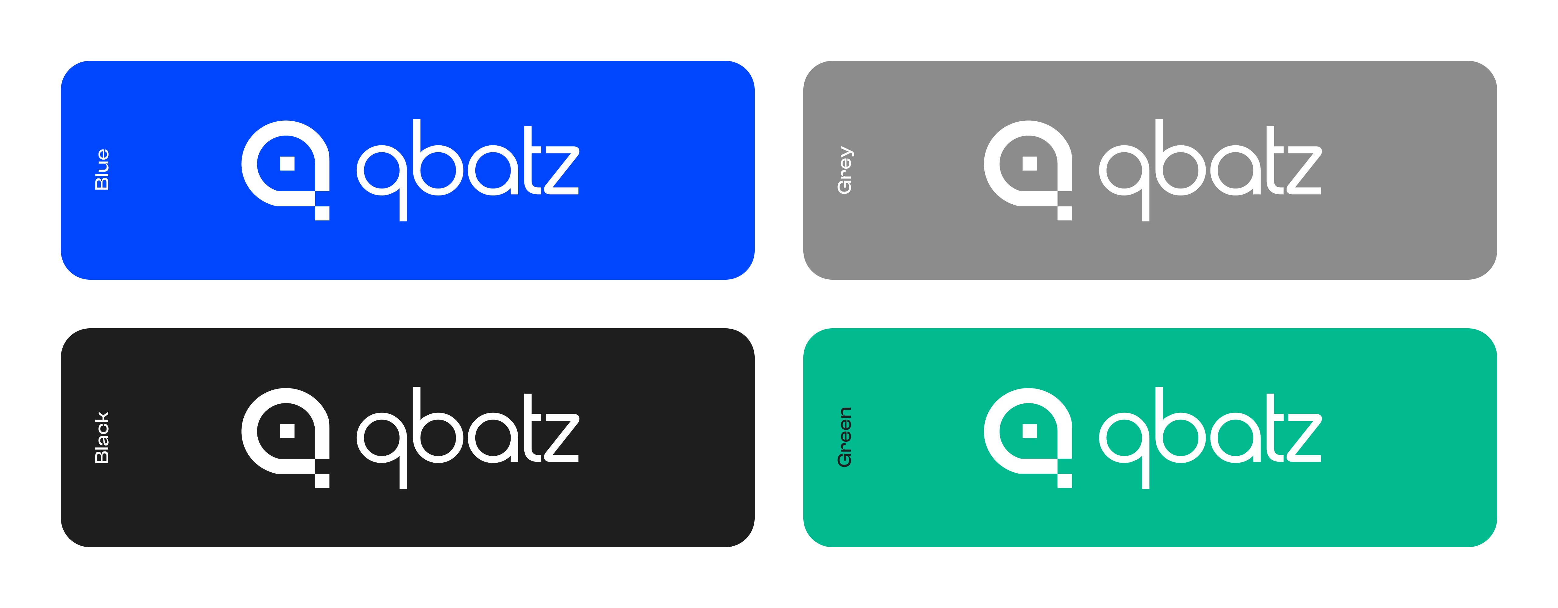
Restricted Zone
To maintain its integrity. The “QBATZ” logo should always be surrounded by enough space to make it appear as open and clear as possible. This avoids competition with other elements and ensures that the logo retains its visual impact.
Please note that the defined space is minimum. It is permitted and recommended to increase it to optimize the visibility of the logo.

Logo Misuse

Colours
Primary Colour Palette
Colour is key factor in quickly recognizing our brand. It is crucial that our brand colours are accurately represented.

Deeper Blue Shade - Primary Colour
Like most blues, it evokes trust, security, and reliability, which is why it's often used in corporate and tech settings.

Vibrant Teal-Green - Secondary Colour
Teal is often used in tech and modern design, evoking a sense of innovation, creativity, and forward-thinking.

Secondary Colour Palette

Typography
Primary Typeface
QBATZ’s main font is Harry Pro TM is a font family known for its elegant and classic serif design. It has a sophisticated, formal feel that works well in branding and logo design where a sense of tradition and refinement is desired.

Type Hierarchy
It is important that the hierarchy is clear. Use size and colour to ensure the message is always clear and conise.

Brand Applications