Client
Aarthi Scans and Labs
Category
Healthcare
Year
2025
Project Description
Vital Insights is the performance and longevity lab from Aarthi Scans and Labs, and I designed its website, mobile app, social media and print collateral.
Vital Insights tests the body on three axes: structural, chemical and functional. The menu includes full-body MRI, DEXA, VO2 Max, advanced blood panels and more, and every assessment ends with a personalised plan covering exercise, nutrition, supplementation and lifestyle.
Tools / Tech stack
. Figma . Framer . Adobe Photoshop . Adobe Illustrator . Canva . ChatGPT . Claude . Google Gemini . Notion
Roles
. Lead Designer . Brand Designer
Problem
Routine health checkups tell you whether you are sick. They do not tell you how your body performs, how fast it is ageing, or where it is weak.
Aarthi Scans already ran one of India's largest diagnostics networks, described in its own words as 47 MRI centres and 50 CT scan centres. Vital Insights was built to move that capability from diagnosing illness to unlocking potential, what the brand calls Medicine 3.0.
That created three design problems:
Trust. A new lab category with no public reference point, selling medical-grade scans to people who feel healthy.
Complexity. MRI, DEXA, VO2 Max and blood biomarkers produce dense data. Reports that sit in a PDF folder change nothing.
Consistency. One brand had to work across a website, an app, social feeds and printed material, in three cities.
Our Approach
The brand line is "Champions don't guess. They measure." Every design decision had to back that up with data, not decoration.
Lead with the number. Stats, scores and biomarkers get the heaviest type. Copy supports them, never the other way round.
One system, four surfaces. The same palette, two typefaces and rounded-pill CTAs run across the website, app, social posts and print.
Sell the outcome, not the machine. The homepage opens with the flagship APEX assessment, then the app, then DEXA, instead of a list of equipment.
Make the report the product. The app exists so results are tracked, trended and explained, with no PDFs and no waiting.
Stay out of pharma territory. No clinical blue, no stock-photo smiles. The look borrows from sport and performance brands.

Styleguide
Three colours, two typefaces, no exceptions. Restraint is what keeps a four-surface system consistent.
The rules that do the work:
Tints only. Shades of the three core colours are allowed. No blues, greens or purples.
Numbers get their own font. A Vital Score or VO2 max value is always set in Instrument Sans at a heavy weight, even inside body text.
One loud background per layout: white, ink or orange, never a mix.
Orange text is for emphasis words, stats and links, never full paragraphs.
Rounded-pill CTAs, and glassmorphism chips (white outline, about 15% white fill) on orange backgrounds.
Flat colour blocks. No heavy shadows or gradients. A subtle radial glow on orange is the only exception.
Visual Design
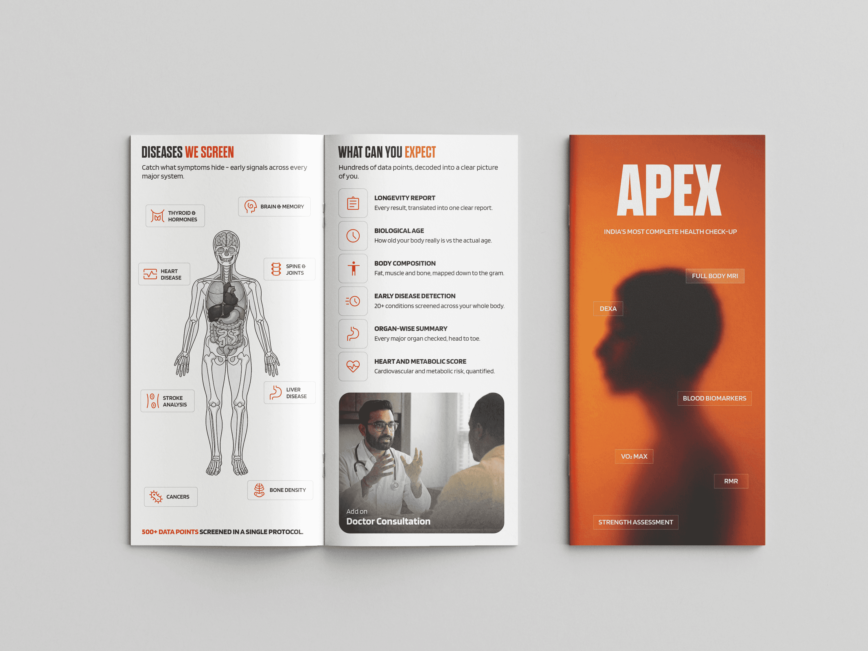
All the collaterals that includes pamphlets, brochures and flyers.

Outcome
The system is live across four centres in three cities, and the app is in its 2.2.1 release. These are the numbers I can source today:
Metric | Value | Source |
|---|---|---|
Centres live | 4 (Chennai x2, Bangalore, Hyderabad) | vitalinsights.in |
Tests on the menu | 15 | vitalinsights.in |
Anna Nagar centre launch | 29 October 2025 | Press release |
4,198 followers, 170 posts | ||
Android app | 100+ downloads, version 2.2.1 | Google Play |